Project Overview : This Streamlit-based web application is designed to showcase interactive data
visualization and analysis tools. The platform allows users to upload earthquake-related CSV files,
explore dataset summaries, and generate insightful visualizations such as scatter plots, geographic maps,
and statistical summaries. Its intuitive design enhances data accessibility and provides meaningful insights
for decision-making.
Please visit the Projects Page for more details >>>
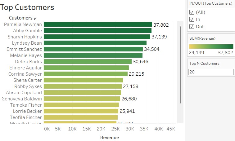
The primary goal of this project was to provide clear and actionable insights into revenue trends and
performance metrics across various dimensions, such as time, location, and product categories.
This project demonstrated the integration of SQL and Tableau to create an end-to-end data visualization
solution that transformed raw sales data into actionable insights. The process involved meticulous data preparation,
including normalization and aggregation in SQL, followed by advanced visualizations and an interactive dashboard in Tableau.
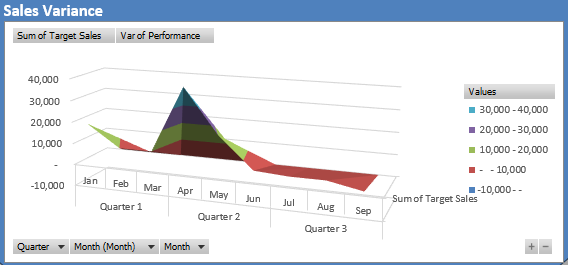
This interactive dashboard project helps to track and analyze key sales and profitability metrics,
leveraging structured pivot tables and dynamic visualizations. Using monthly, quarterly, & regional breakdowns,
the dashboard provides insights into sales performance, profit trends, customer engagement, & target achievement.
It empowers decision-makers with actionable insights to optimize strategies and improve overall business performance (KPI)
By using pivot tables, charts, & filters, the dashboard offers insights for data-driven decisions
to optimizing sales strategies, improving profitability, and understanding customer dynamics.
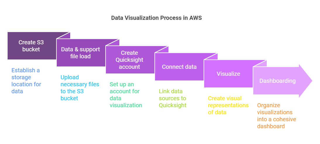
This project involved analyzing Netflix movie and TV show production data
(show_id, title, director, cast, etc.) from 2007 to 2021 by utilizing Amazon QuickSight
for data visualization. The process included loading data into an S3 bucket,
connecting it to QuickSight, and creating a comprehensive dashboard for visual analysis,
enabling better insights into trends and patterns in Netflix’s content library.
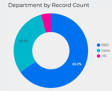
This is a brief HR Analytics visualization which provides some insights into HR demographics shedding
some lights into various distribution patterns of the data.It has uncovered the truths of education,
department, job satisfaction and income as well.
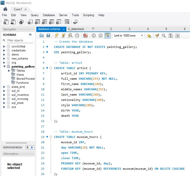
This project involved leveraging SQL and Python to analyze a rich dataset on paintings, artists, and museums.
By loading the data into a MySQL database and executing targeted SQL queries,
we answered key business questions regarding museum operations, artist popularity, canvas pricing,
and painting styles. The insights obtained provide actionable information on global art trends and
operational details of museums.
This analysis provides a comprehensive view of revenue and profit performance across various branches over multiple years,
highlighting the top-performing branches based on both revenue and profit metrics.
Using visualizations like clustered bar charts, key metrics were compared,
offering a clear understanding of the relative performance of each branch. This insight is essential
for identifying trends, assessing profitability, and guiding strategic decisions to optimize branch operations
and improve financial outcomes.